How Automotive Logos Evolved
By marcela • October 23, 2020
The brand is often a key factor behind car purchases . While the style of the car is important, buyers develop a level of loyalty and trust with the brands themselves.
Nothing represents a brand more than the logo , which is literally the image of the brand. However, a good logo often doesn’t get set in stone with the first choice. As brands develop and times change, so do the images that represent them.
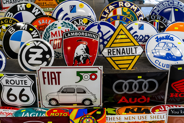
Here we take a look at how these brand badges have changed for some of the most well-known manufacturers . Each logo tries to depict the history and morals of a company, its key qualities .
Logos can also represent the characteristics of customers. After all, someone driving a BMW is often seen in certain ways by others, as is someone driving a Mercedes or Bentley. The brand not only represents the company but also is a symbol of the personality or status of those car owners.
To get where they are today, every automobile manufacturer has gone through a multitude of changes, as have their iconic badges which are displayed proudly on their vehicles. While some logo designs settled early, some are almost unrecognizable from their originals.

Alfa Romeo
The Alfa Romeo’s badge first hit the market in 1910. It was split to have a red cross and white background on the left and has a snake on its right with a man coming out of the mouth.
The left represents the city of origin for the manufacture, whereas the right was the family crest of the Visconti family (a noble family of the era). The logo was the inspired masterpiece of Romano Cattaneo, encompassing the company’s origins, nobility, and strong ties to the Italian way.
Aston Martin
Aston Martin, the famous luxury British manufacturer, began in 1913. Aston Martin started as a reseller but quickly went on to develop its own vehicles and brand. As a unique brand, their cars ended up in James Bond movies, adding a level of both eliteness and a certain level of ‘cool’ factor at the time.
The initial logo was simply an overlay of the A and the M. After a brief pause in trading, the company relaunched with the more familiar wings and Aston Martin spelled out across them. As time has gone on, the wings have continued with a smaller and more refined insertion of the name.
Audi
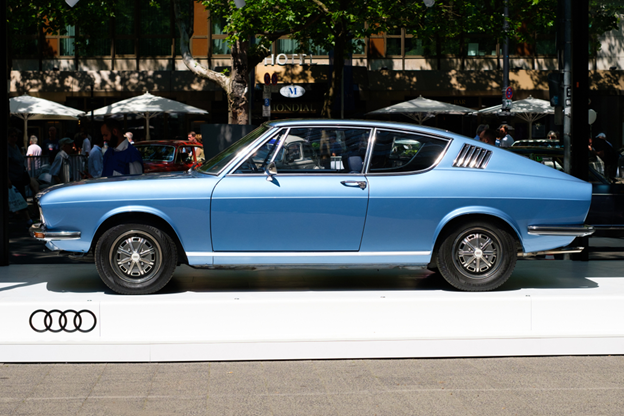
Audi, a German brand known for quality, is strongly linked with the Volkswagen Group. The original company needed to be rebranded after a dispute. The name Audi was born, as it was the Latin word for the same meaning of the name of the owner, which is “listen”. Horch became Audi, and so the brand continues.
The logo we see today originated from the joining of Audi, Horch, DKW, and Wanderer. They formed an Auto Union, which is represented in the rings of the Audi logo. At the time, these companies were mainly using the logo when racing, but as all of them merged fully in 1985, Audi’s logo was born as a representation of the four merging into one.
While Audi started with a keychain looking logo, with Audi in a triangle hanging below a 3D number 1, the interlinking rings have since been the main feature of all of the logos except for 1969 having a single oval with the name Audi printed inside.
BMW
BMW has developed a reputation for comfort, quality, and performance. Since 1916 their logo has remained almost the same. The only parts that have changed are the colorings of the ‘rings’ and some color tone variations to the white and blue center.
However, the company itself actually started as an aircraft manufacturer. Some believe that the center of the logo originated from the propeller of the plane, as seen from the pilot’s seat, and others that it represents the Bavarian flag. The change to land vehicle productions came after WWI.
Buick
Buick Motor Company, a part of General Motors, began in 1903. Named after the original founder, David Dunbar Buick, Buick has been under different ownership over the years. As with various owners, it has also been through a few logo changes over the years.
After playing with designs that strongly featured the word “Buick” and various, single shields, the company settled on the three-shield design, a variant of which is still active today. This design dates back over 55 years and is representative of the original founders’ family crest.
Cadillac
Cadillac has a varying logo and interesting history. The name comes from Sir of Cadillac, Antoine de la Mothe Cadillac. It was founded in 1902 and the logo started as the family crest, which in fact was created by Antoine by combining different aspects of family crests of the era.
Despite being changed dozens of times, the crest has remained a key part of the logo design throughout. At times, it was in the center of large wings as the logo style evolved. Today, it is back to a more simplified and modern version of the family crest.
Chevrolet
Since 1913 the logo has undergone several redesigns. However, that iconic cross emblem has remained strong and true throughout. Some colors have changed and the name “Chevrolet” inserted, of the logo framed by a shield, etc., but the iconic emblem design stood the test of time.
Where it originates seems to be a bit of a mystery. Whether it was a pattern spotted in wallpaper, a doodle, or a tribute to Switzerland … nobody seems sure. The official 50th-anniversary statement by the company suggests the wallpaper story:
“H e saw the pattern … as a design on wallpaper in a French hotel. He tore off a piece of the wallpaper and kept it to show friends. ”
Ferrari
Ferrari pulled off a timeless design from the beginning. There is almost no noticeable difference between the present design and that of the 1947 logo.
The logo is said to be in memory of a national hero, the prancing horse being on the plane of Francesco Baracca. The use of the design was apparently at the request of his mother, and so Enzo Ferrari combined it with the vibrant yellow as a show of respect to both the ace fighter pilot and his place of birth (Modena is represented by the yellow).
Ford
The third company of Henry Ford, founded in 1902 as Ford & Malcomson, Ltd. It was the joining of investors to save the company that resulted in the renaming as Ford Motor Co. This name was the centerpiece of the original 1903 logo.
During the early years, the logo design changed significantly, but quickly found the oval design with Ford in the center as we know it today. There have been some adjustments to coloring, but overall the oval badge has been around since 1912 and the blue coloring we are so familiar with added in 1927.
There have been occasional tests over the period since, trying a new shape or style here and there, but the blue oval branding is the one that won out overall.
Honda
This is another great example of simplicity in design that has lasted throughout time. As far as the Honda logo goes, it has hardly been altered since the inception. For the automobile line, this has remained a strong and easily recognizable brand logo since the 1970s.
Jaguar
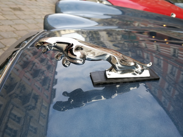
Swallow Sidecar Company, changed to being a car producer in 1934. The Jaguar cat logo didn’t develop until 1945, however, when due to WWII issues with the existing “SS” company branding (close to a certain Nazi organization of the era) from “Swallow Sidecar” it was rebranded as Jaguar Cars Limited. That unfortunate ‘association’ helped to create a famous and easily recognized branding.
Since then, the logo of the jumping jaguar remained until the 2000s. Yet, the previous logo can often be found on modern vehicles in stylings, but the grille has been replaced with the head of a roaring jaguar.
Mercedes-Benz
The logo of Mercedes started as the company name only in 1902. However, what we know as the company of Mercedes today was actually born as a merging of interests (and financial advantages) between DMG and Benz & Cie as a syndicate in 1924.
The initial designs mostly played with the name, followed by the 3-point star as the center of the design in 1916. It wasn’t until 1933 when the logo evolved into the 3 point-star in a circle as we know it today. Since then, only subtle changes to dimensions and proportions have occurred over what is now almost 100 years of the design.
Porsche
Porsche started out as a consultancy, helping design the very first Volkswagen car (the renowned Volkswagen Beetle). The company name and branding only transitioned fully to being Porsche in 1931.
The logo was designed to represent the company’s founding location. The original was based on the coat of arms of the Free People’s State of Württemberg. The yellow rearing horse logo was later designed to represent Stuttgart city (the capital of Free People’s State of Württemberg). Later, a merging of the powerful rearing horse on the yeller background with the coat of arms occurred in 1952. Since then, the design hasn’t changed much and is iconic, recognized by almost everyone with an interest in cars.
Subaru
“Subaru” is “united” in Japanese and so it was decided to use the Pleiades star cluster as a representation of the merging of companies. The logo is also meant to be the representation of the 5 smaller companies merging to become one larger ‘star’ in the automobile industry. Seeing the “ Pleiades constellation is a unification of the stars ”.
Toyota
“Toyota” was the beginning, in 1935, a western translation of the family name. A competition for logo design in 1936 led to Toyota being born, as the new translation’s pronunciation was preferred and the new design was connected with luck in the Japanese lettering and used for the logo, so they actually changed the company name officially to Toyota.
From there, just the written company name as “Toyota” in logos continued until 1989, where the symbol of Toyota was added above the name. The symbol is meant to depict a level of trust and love between the company and its consumers. Reliability being one of the major factors.
Volkswagen
“People’s car” in German, the literal translation of the word “Volkswagen”. Surprisingly to many, the concept came from Hitler in 1933 at the German Auto show. The company name Volkswagenwerk GmbH was born in 1938 and a state-funded factory was opened by Hitler under the brand and produced predominantly military vehicles. The Beetle design had been born and although only rebranded as the Beetle after the war, it is still one of the most loved ‘quirky’ cars on the market today.
The logo design started as the VW style we know today, but was shaped into a more Nazi flag style at the beginning. The circle encased VW has remained almost unchanged (except for an odd square in 1960) until the present day. In this case, the colorful beginning didn’t cause ongoing logo changes, but instead, they quickly adopted a simplified version of the original that has stuck around throughout almost a century of trading.
Volvo
After starting out with just the brand name in an oval, the unique logo shape was issued second. It is the representation of iron as an ancient alchemical symbol. Many consider that it came from a symbol of masculinity, or from the symbol of Mars. Today, either the brand logo symbol with the name “VOLVO” through the middle or simply the name “VOLVO” in all-caps is used to represent the brand. The Volvo logo represents the “traditions of the Swedish iron industry: steel and strength with properties such as safety, quality, and durability.
Summary
This article doesn’t cover all brands, but it is a good example of how some styles were set from the beginning. W, whereas other companies went through numerous changes, rebranding, and more before they settled on a stable image. Some, of course, are still a ‘work in progress’ and their logos are evolving.
The post How Automotive Logos Evolved appeared first on (EN) 1(800) Car-Title®.
HOW MUCH IS MY CAR WORTH?


USA Patriot Act Disclosure: Important information about procedures for opening a new account
To help the government fight the funding of terrorism and money laundering activities, Federal law requires all financial institutions to obtain, verify, and record information that identifies each person who opens an account. What this means for you: When you apply for a loan, we will ask for your name, address, date of birth, and other information that will allow us to identify you. We may also ask to see your driver's license or other identifying documents.
Loans may be made by one of several lenders, including: Wilshire Commercial Capital L.L.C. dba 1 (800) Car-Title and Wilshire Consumer Credit, a licensed lender in certain states. Loans not available in all states. In California, loans are made pursuant to a Department of Financial Protection & Innovation (DFPI) Finance Lenders License. See State Disclosures for additional information.
Accessibility Statement. We are committed to ensuring digital accessibility for people with disabilities. We are continually improving the user experience for everyone and applying the relevant accessibility standards in compliance with Web Content Accessibility Guidelines. For feedback on our website accessibility or if you have any problems with the access of our website please call our toll-free number 800-589-0290 or email us at WilshireCustomerCare@WilshireConsumer.com and we will assist you.
Wilshire Commercial Capital, LLC dba 1 (800) Car-Title and Wilshire Consumer Credit is located at 4727 Wilshire Blvd, Suite 100, Los Angeles, CA 90010.
NMLS ID:907578 | Click here for the NMLS Consumer Access Database.
TO REPORT A PROBLEM OR COMPLAINT WITH THIS LENDER, YOU MAY WRITE OR CALL Tracy Bergiman, Director of Compliance, 4751 Wilshire Blvd. Suite 100, Los Angeles, CA 90010, 323-837-5775, tbergiman@westlakefinancial.com.
New Mexico Only: This lender is licensed and regulated by the New Mexico Regulation and Licensing Department, Financial Institutions Division, P.O. Box 25101, 2550 Cerrillos Road, Santa Fe, New Mexico 87504. To report any unresolved problems or complaints, contact the division by telephone at
(505) 476-4885 or visit the website: https://www.rld.nm.gov/financial-institutions/.
Copyright. Wilshire Commercial Capital, LLC. dba 1 (800) Car-Title and Wilshire Consumer Credit. All Rights Reserved.


